Colours that sing - tips for choosing colour combos.

How do you decide what colours to put together? Even the most confident knitter can get a bit stunned in front of a wall of colours, and I can certainly spend an inordinate amount of time dithering over what to choose, what to put with what and how many colours to buy. The more choices I have the worse it is! So how do we choose colour combos that we’ll love? I’ve put together some tips to help you decide.
Start with colours you love.
It’s tempting to listen to outside voices and stretch “out of our comfort zone”, but if you have colours that make your heart beat faster why not stick with them? Knitting is happier when we feel excited about the yarn on our needles and colour is a big part of that. Plus, if you’re knitting something for yourself to wear, you’ll want to love wearing it!
There are a few tried and true ways to choose colours to put together.
Monochromatic colour schemes are gentle and reliable and use the same colour in different intensity. Think light to dark or, like my Floozy Too, different shades of one colour.
Analogous colour combos tend to be classic and elegant and are usually very calming to the eye. Look at the rainbow and choose a few colours that sit next to each other. Perhaps lilac, purple and dark blue, or apple green, sea blue and royal blue. It looks good to keep analogous colour combos the same undertone, such as all warm or all cool, to keep things from looking muddy. (Don’t forget that some shades of red and yellow are cool if they have blue undertones, and some shades of blue and green are warm if they have yellow undertones, etc.) Sticking to shades around one primary colour can also be effective, for example, pink-red-orange like my gold Floozy cardigan.
Complementary colour schemes use opposite colours. If you’re not sure which colours are opposite, try looking at one colour for a long time and then looking at a white wall and see the opposite colour appear. Complementary colour schemes tend to be the most striking colour schemes but we have to be a little careful that they don't end up looking too intense (think sports teams!) unless that's what you're after. You can tone a complementary colour scheme down by using one as a pop of colour, and you can make things really interesting by going for colours that aren’t pure primary colours (red, blue and yellow) like I did with my pink Floozy cardigan.
Make simple colour plans.
Try a light-dark-bright combo. Choose a light colour, a dark colour and then a bright colour.
If you’re knitting something in two colours, try choosing two skeins from the light-dark-bright combo.
Three colours? Try one of each.
When you’re working on something with four or more colours, choose a background colour and combine that with a light-bright-dark combo.
I love getting out my coloured pencils and planning colours.
Sometimes things just don't look the same on paper as they do in my head and it's great to figure that out before I cast on.
Truly Myrtle patterns always include a schematic that you can print out and colour in (enlarge it if you have to) and for some patterns, I’ve also included a colouring page.
Dirty Lace and Flounce shawls have colouring pages as does Sister From Another Mister hat. Grab your paints or pencils!
Even if you don't get a chance to knit any stitches over the next couple of weeks, maybe you can dream about colours?!
Swatching colours immediately tells you whether they’ll work.
I always recommend swatching but especially so when you’re knitting a garment or putting colours together.
Whenever I design a new pattern I have to swatch and one of the things that swatching tells me is whether the colours I’ve chosen work happily together.
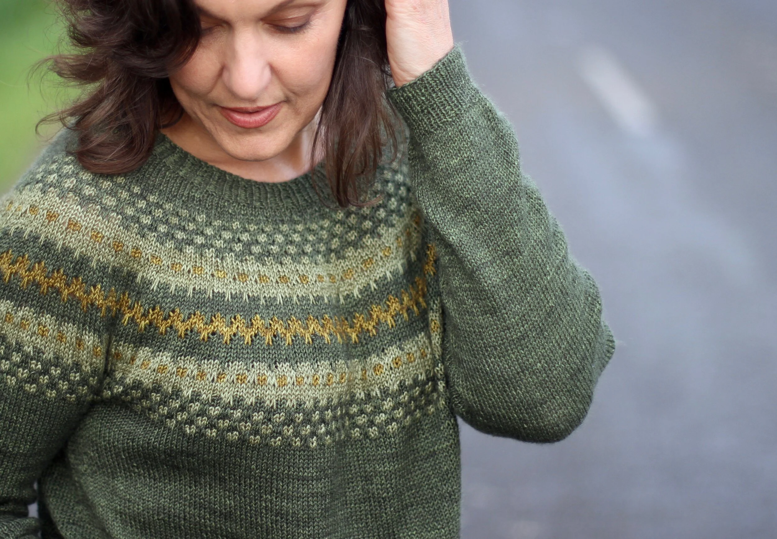
I started with a handful of greens for my Floozy Too sweater but it didn’t take me many rows to realise that the I needed a zingy green pop to lift it into something special. I wonder what your swatches will tell you?
Tips for shopping.
If you can, buy colour cards. It’s great to see colours in real life and how they work together before you commit to a sweater's worth of yarn.
Use your online shopping carts to lay things out. Look critically. Do the colours in your cart work? What happens if you add another colour or take one away? Do you still like your combo?
If you’re in a store, look at the colours you’ve chosen in daylight, head over to a window or door if you have to. Bright shop lights can make colours look different.
Mostly, trust your gut …. and swatch ;)